Overview
Year
2024
Duration
6 months
Role
Brand Design
Print Layout
Tools
InDesign
Illustrator
Photoshop
Figma
Reel Times is a quarterly magazine for fishing in Washington. From beginner tips to expert techniques, we cover local waters, seasonal catches, gear essentials, and recipes.
Reel Times is a quarterly magazine for fishing in Washington. From beginner tips to expert techniques, we cover local waters, seasonal catches, gear essentials, and recipes.
Goal
Build Community: Highlight local stories and events.
Visual Appeal: Feature high-quality photography, hierarchy, and engaging layouts to make content visually inviting.
Educate Readers: Offer practical advice on local fishing techniques and gear recommendations.

Make fishing accessible and exciting magazine that blends beautiful visuals with useful content for all skill levels?
Make fishing accessible and exciting magazine that blends beautiful visuals with useful content for all skill levels?
How might we
How might we
User Profiles
Reel Times is designed for readers who connect with fishing in personal level. Whether through visual storytelling, leisure reading, or time spent outdoors with others. These profiles reflect the intended audience the magazine aims to reach.

Coffee Table Reader
Loves beautiful print objects, collects regional magazines, and enjoys flipping through while relaxing.

Fly Fishing Aficionado
Combines fishing with content creation. Enjoys spreads that inspire travel, storytelling, and that “PNW mood.”

Curious Beginner
Looking for local spot recommendations, and gear suggestions that make it easy to get started.
Design
Design
Design
Discovery Phase
I began this project by visiting a bookstore to study existing fishing magazines. As I flipped through several titles, I noticed recurring issues: cluttered layouts, outdated typography, and a lack of distinct visual identity. These problems make it difficult for brands to stand out or connect with today’s modern readers.
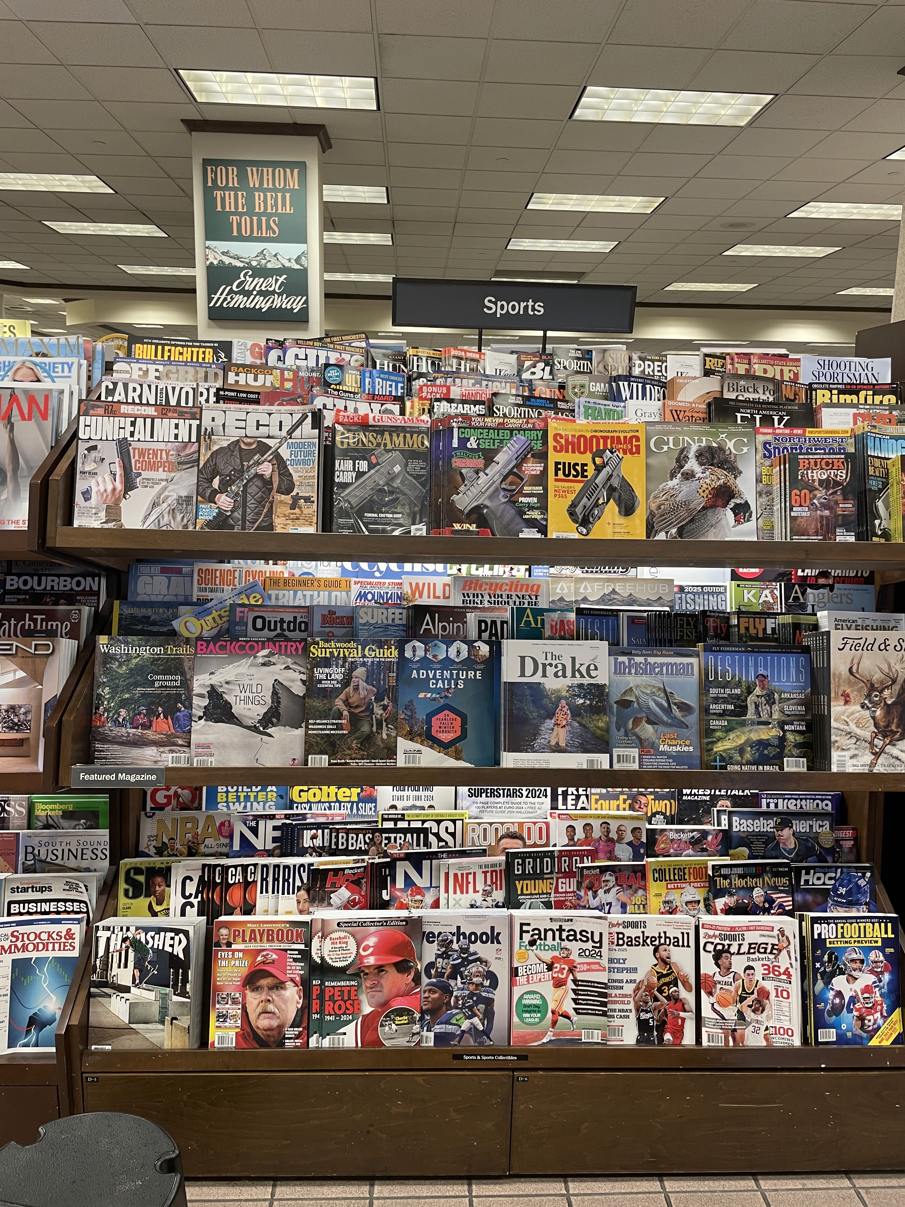

Brainstorm
For this magazine, I drew inspiration from publications influenced by the Swiss International Typographic Style. Known for its grid-based layouts, neutral design language, and intentional use of photography.

Brainstorm
For this magazine, I drew inspiration from publications influenced by the Swiss International Typographic Style. Known for its grid-based layouts, neutral design language, and intentional use of photography.
Brainstorm
For this magazine, I drew inspiration from publications influenced by the Swiss International Typographic Style. Known for its grid-based layouts, neutral design language, and intentional use of photography.

Typography
Circular: is a geometric sans-serif that’s clean, versatile, and approachable. Its legibility makes it ideal for body copy and establishing a modern editorial tone.
Operetta: used for titles and wordmark, bringing an elegant, high-contrast serif character that adds sophistication and visual hierarchy to the layout.
Typography
Circular is a geometric sans-serif that’s clean, versatile, and approachable. Its legibility makes it ideal for headlines, titles, and establishing a distinct editorial tone.

Moodboard

Moodboard
Moodboard

Process
Process
Process

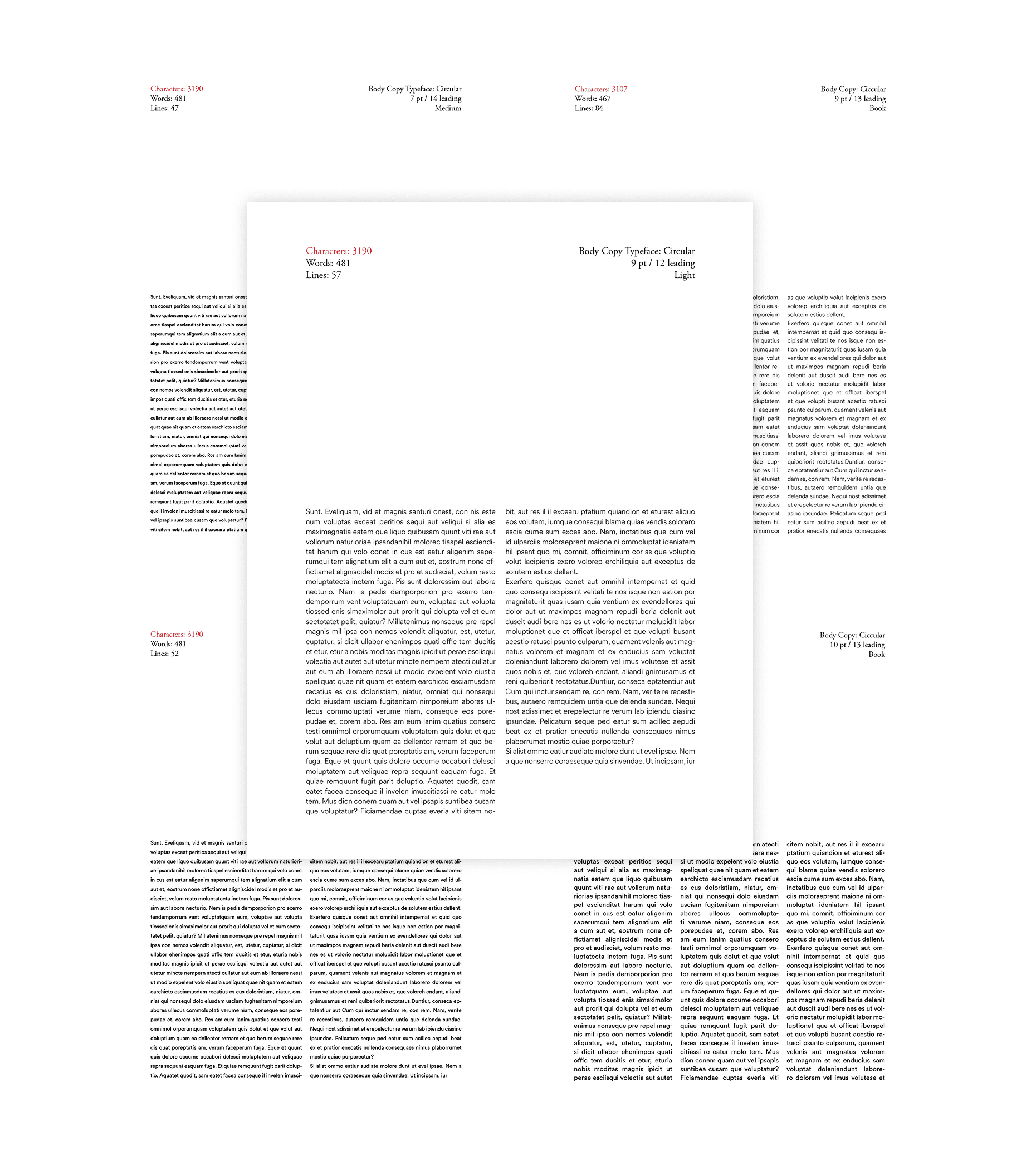


Type Setting
Before committing to my chosen body typeface, Circular, I conducted several tests to ensure it offered enough weights and styles for the articles. This involved multiple rounds of refining the font style, weight, and leading. Ultimately, I selected Circular at 9pt size, 12pt leading, and a light weight for legibility in print.
Flatplan
Similar to setting up low-fidelity wireframes for screens, this phase involved arranging layouts and pages so the magazine would flow like a storyboard. I decided to section my magazine by starting with tips and suggestions, followed by popular fishing spots, and ending with recipes as a nod to our tagline: "From Catching to Cooking."
Visual Elements
To enhance visual interest and readability, I added supporting elements like pull quotes using Operetta 12 and callout blocks for key details such as locations, creating a more organize and engaging reading experience.
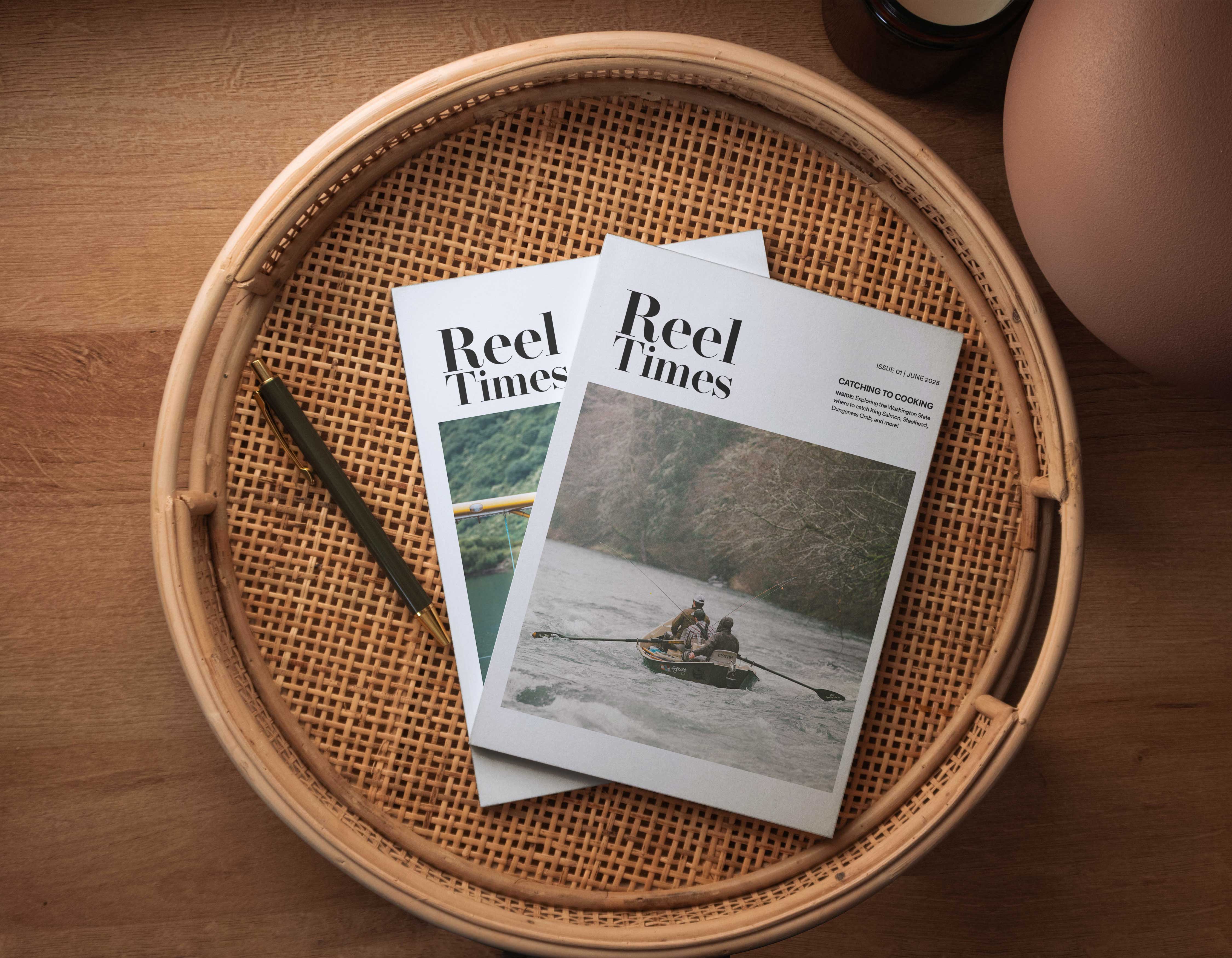
Cover
Reflecting on my initial bookstore visit, I knew the cover had to break away from cluttered designs. I explored over 20 nameplates and layouts, ultimately selecting Operetta 32 to pair with Circular for a modern, distinctive look inspired by Swiss Style magazines.
Printing
Stepping away from the screen and working hands-on was a valuable learning experience. I printed the hardcover and interior pages separately, then manually glued everything together. Carefully aligning the spine to ensure a clean finish. The entire process took around two hours, mostly spent waiting for the glue to set.
Type Setting
Before committing to my chosen body typeface, Circular, I conducted several tests to ensure it offered enough weights and styles for the articles. This involved multiple rounds of refining the font style, weight, and leading. Ultimately, I selected Circular at 9pt size, 12pt leading, and a light weight for legibility in print.
Flatplan
Similar to setting up low-fidelity wireframes for screens, this phase involved arranging layouts and pages so the magazine would flow like a storyboard. I decided to section my magazine by starting with tips and suggestions, followed by popular fishing spots, and ending with recipes as a nod to our tagline: "From Catching to Cooking."
Visual Elements
To enhance visual interest and readability, I added supporting elements like pull quotes using Operetta 12 and callout blocks for key details such as locations, creating a more organize and engaging reading experience.
Cover
Reflecting on my initial bookstore visit, I knew the cover had to break away from cluttered designs. I explored over 20 nameplates and layouts, ultimately selecting Operetta 32 to pair with Circular for a modern, distinctive look inspired by Swiss Style magazines.
Printing
Stepping away from the screen and working hands-on was a valuable learning experience. I printed the hardcover and interior pages separately, then manually glued everything together. Carefully aligning the spine to ensure a clean finish. The entire process took around two hours, mostly spent waiting for the glue to set.